Quick Overview
For this project, I explored the climatic data gathered by weather stations inside two neighboring national parks. I thought it’d be interesting to see how different the weather would be between two parks that are around 100 miles apart.
I analyzed the data stored for the year 2018. The data was saved in the CSV format and consisted of high and low temperatures. I then used Matplotlib to generate a plot that displayed the differences between both parks.
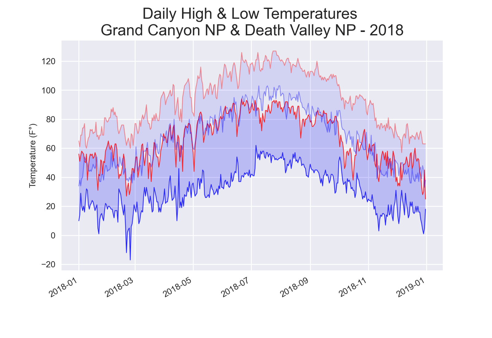
As a result, the plot (Figure 1) showed drastic climatic differences. Death Valley data is shown as transparent, while Grand Canyon is opaque. Both parks displayed a high range of temperatures during the day, but overall the grand canyon presented much lower temperatures. Additionally, the plot displayed an interesting pattern that occurred throughout the year. The Grand Canyon highs were the approximate lows for Death Valley.
But why such a shift in temperatures between the parks that are only 100 miles away? My hypothesis is the difference in altitudes. The Grand Canyon sits around 7000” in elevation, while Death Valley is at a whopping -200” below sea level.
 Figure 1: A plot showing the highs and lows of two US national parks. Death Valley is shown as transparent.
General Setup
import csv
import matplotlib.pyplot as plt
from datetime import datetime
Make sure to import the necessary modules and packages. You can find all the necessary files for this project within the projects’ GitHub repository. If you are curious to explore weather data from other locations, you can visit the official NOAA website.
Creating a Function to Analyze and Store Weather Data
def store_data(filename):
    """Retrieves relevant data from CSV file for plotting"""
    with open(filename) as f:
        reader = csv.reader(f)
        header_row = next(reader)
        indexes = {}

        # Create a dictionary for the indexes of each column_header.
        for index, column_header in enumerate(header_row):
            indexes[column_header] = index

        # Temporarily store each date, high and low temp in a variable.
        # Then permanently store it in its' corresponding list.
        for row in reader:
            date = datetime.strptime(row[indexes['DATE']], '%Y-%m-%d')
            try:
                high = int(row[indexes['TMAX']])
                low = int(row[indexes['TMIN']])
            except ValueError:
                print(f"Missing data for: {date} for the following file:"
                      f" \n{filename}")
            else:
                dates.append(date)
                highs.append(high)
                lows.append(low)
The function store_data() starts with extracting the header row and placing it in the variable header_row. We will be using this row to find out the indexes that we need to extract the correct values from each row. If it’s required to analyze several data sets, it is highly recommended to use an empty dictionary to store the correct indexes for each column header of each data set. This way, one will not have to hardcode each corresponding index for every single file since indexes can change from file to file.
Within a for loop, the function starts to extract each date, high and low temperature from each line (each line in the CSV file represents a day), and stores it in a temporary variable. The function then appends each value to its’ corresponding list (the lists are defined before store_data() is called). To prevent any crashes, I used an exception to detect missing data in the CSV files.
Plotting Data
# Initiate plot
plt.style.use('seaborn')
fig, ax = plt.subplots()

# Plot Grand Canyon NP - 2018
dates, highs, lows = [], [], []
store_data('data/grand_canyon_np_2018_full.csv') # path where your CSV file is located

ax.plot(dates, highs, c='red', linewidth=0.9, alpha=0.8)
ax.plot(dates, lows, c='blue', linewidth=0.9, alpha=0.8)
ax.fill_between(dates, highs, lows, facecolor='blue', alpha=0.2)

# Plot Death Valley NP - 2018
dates, highs, lows = [], [], []
store_data('data/death_valley_2018_simple.csv')

ax.plot(dates, highs, c='red', linewidth=0.9, alpha=0.4)
ax.plot(dates, lows, c='blue', linewidth=0.9, alpha=0.4)
ax.fill_between(dates, highs, lows, facecolor='blue', alpha=0.1)

# Formatting overall plot
ax.set_title("Daily High & Low Temperatures \n"
             "Grand Canyon NP & Death Valley NP - 2018", fontsize=18)
ax.set_xlabel('', fontsize=10)
fig.autofmt_xdate()
ax.set_ylabel('Temperature (F°)', fontsize=10)
ax.tick_params(axis='both', which='major', labelsize=10)


plt.show()
Now we are ready to create the plot. The first step is to create three empty lists to store all the data points. Afterwards, we make sure to call our handy function store_data(). Finally, we can call plot() for both highs and lows. The process is the same for the second national park. I would recommend customizing the graph a bit to help distinguish between the two datasets.