
Background
Safe drinking water is a basic human right, whether used for drinking, food production, or basic hygiene. Although 70% of the earth’s surface is covered in water, there are still countries and communities that lack easy access to safe drinking water. Unsafe drinking water can be contaminated with hazardous chemical and animal waste, and dangerous amounts of naturally occurring substances.
Untreated water can pose a health risk, and cause the distribution of infectious diseases or even death. It is to the advantage of a country to provide access to safe water, as it has shown to positively impact economic growth.
This dataset analyzes several water quality properties to determine the potability of water. For this case, I will be conducting exploratory data analysis on this dataset and learn about what defines safe drinking water.
Water Quality Metrics
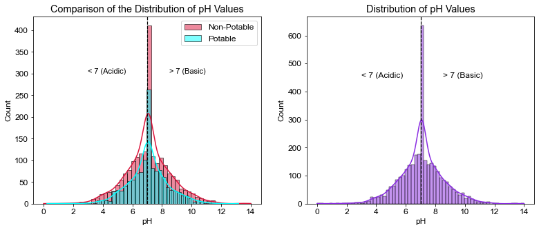
- pH: The measure of how acidic or basic water is. Ranges from 0 to 14, with 7 being neutral. EPA has recommended a range of pH from 6.5 to 8.5.
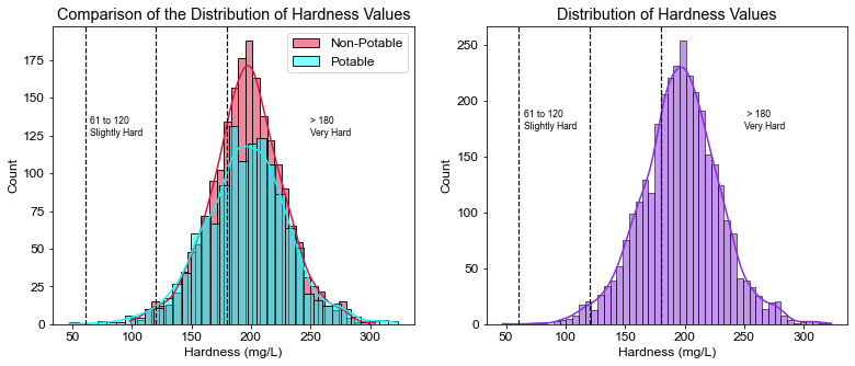
- Hardness: Is the amount of dissolved calcium or magnesium in water in mg/L. According to WHO, drinking water hardness levels can vary between 10-500 mg/L. Hardness values that are too low could cause corrosion in pipes, values that are too high could cause cardiovascular issues in humans.
- Solids(Total Dissolved Solids - TDS): Is used to describe small amounts of organic matter present in water. WHO identifies a TDS level of about 500 ppm as desirable and anything greater than 1000 ppm as unacceptable.
- Chloramines: Common disinfectant used in public water systems. Chloramine values less than 4 ppm are considered safe to drink.
- Sulfate: Natural substances that can be found in water, which can originate from minerals, soil, air, and even plants. A value less than 250 mg/L should protect consumers from the esthetics effects of sulfate, a value less than 1000 mg/L will protect against sulfate’s laxative effects.
- Conductivity: A measure of how well water can pass an electrical current. Conductivity is positively correlated with the number of dissolved solids present in water. WHO recommends an EC value no higher than 400 μS/cm.
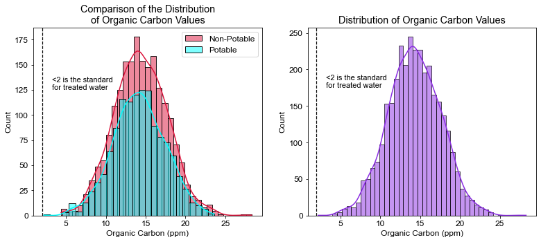
- Organic Carbon: A measure of the total amount of organic carbon in water. Can originate from decaying natural organic matter and synthetic sources. EPA recommends TOC levels less than 2 ppm in treated water.
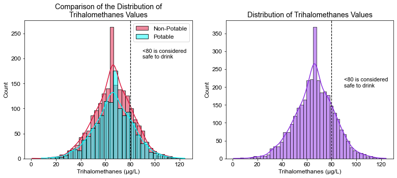
- Trihalomethanes: Carcinogenic contaminants that form during the dechlorination and disinfection of water. According to the EPA, the maximum contaminant level is 80 ppb in treated water.
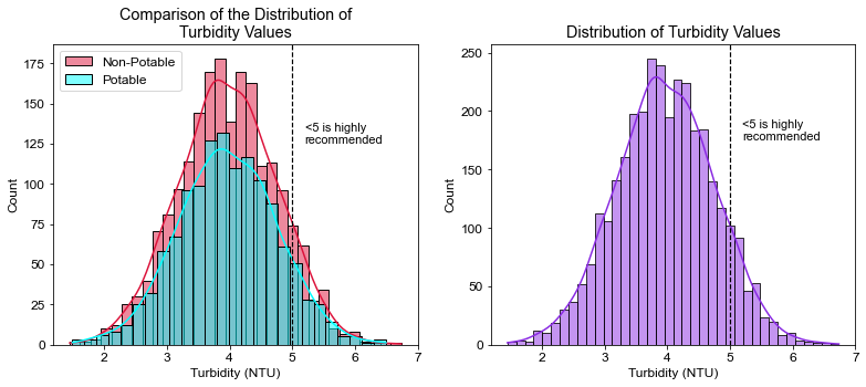
- Turbidity: The measure of the cloudiness of water, which is caused by suspended particles. A sudden change in turbidity is a good indicator of a potentially hazardous change in the water system. WHO recommends turbidity values below 5 NTU.
- Potability: The determination of water that is safe to drink or use. (1 is Potable, 2 is non-potable in this dataset.)
Libraries and Loading Dataset
# Import all necessary Libraries
import pandas as pd
import numpy as np
import matplotlib.pyplot as plt
import seaborn as sns
import math
# Load Dataset
df = pd.read_csv("water_potability.csv")
# Quick analysis of data frame
df.shape
(3276, 10)
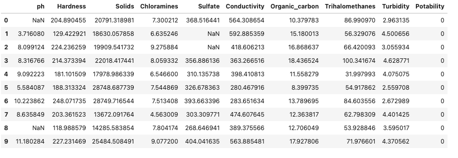
# First ten values on table
df.head(10)
# Descriptive Statistics for each water parameter
df.describe()

Analyzing and Cleaning Columns with Missing Values
# Let's check for null value percentage
((df.isnull().sum() / df.shape[0]) * 100).sort_values(ascending = False)
Sulfate            23.840049
ph                 14.987790
Trihalomethanes     4.945055
Hardness            0.000000
Solids              0.000000
Chloramines         0.000000
Conductivity        0.000000
Organic_carbon      0.000000
Turbidity           0.000000
Potability          0.000000
dtype: float64
-
Unfortuantely, we have some null values in our data set.
-
In order to have a better dataset to work with, I will replace all null values in each category with its’ respective mean value.
# Replace Null Values for Sulfates with Mean Value of Sulfates
S_mean = df.Sulfate.mean()
df.Sulfate.fillna(S_mean, inplace = True)
# Replace Null Value for pH  with Mean Value of pH
ph_mean = df.ph.mean()
df.ph.fillna(ph_mean, inplace = True)
# Replace Null Value for Trihalomethanes with Mean Value of Trihalomethanes
Tri_mean = df.Trihalomethanes.mean()
df.Trihalomethanes.fillna(Tri_mean, inplace = True)
-
Once again, let’s check for null value percentage. All should be at 0%
((df.isnull().sum() / df.shape[0]) * 100).sort_values(ascending = False)
ph                 0.0
Hardness           0.0
Solids             0.0
Chloramines        0.0
Sulfate            0.0
Conductivity       0.0
Organic_carbon     0.0
Trihalomethanes    0.0
Turbidity          0.0
Potability         0.0
dtype: float64
-
This time we see 0% null values for all categories, we are ready to visualize the data.
Visualization and Distribution of Water Metrics
#Potability pie chart
labels = ['Potable', 'Non-Potable']
explode = (0.05,0) # Explode pie chart
colors = ['lightskyblue', 'lightcoral']
plt.rcParams['font.sans-serif']='Arial'
plt.rcParams['font.size']=12
sizes = [df.Potability.value_counts()[1], df.Potability.value_counts()[0]]
fig1, ax1 = plt.subplots()
ax1.pie(sizes, labels=labels, autopct='%1.1f%%', explode=explode, colors=colors)
ax1.axis('equal')
ax1.legend(frameon=False, bbox_to_anchor=(0.8,0.8))
plt.show()
-
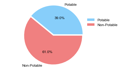
Less than half of the water tested was considered potable. Let’s continue to explore the data.
# Compare the water parameter with regards to Potability
ph_0 = df.ph[df.Potability == 0]
ph_1 = df.ph[df.Potability == 1]


# Create figure to compare potable and non-potable values, add annotations and add vertical lines for annotations
plt.figure(figsize=(13,5))
plt.subplot(1,2,1)
sns.histplot(data=ph_0, color='crimson',alpha=0.5, label="Non-Potable", kde=True)
sns.histplot(data=ph_1, color='aqua', alpha=0.5, label="Potable", kde=True)
plt.axvline(x=7, linewidth=1.2, color='black', linestyle='--')
plt.title("Comparison of the Distribution of pH Values")
plt.xlabel('pH')
plt.annotate("< 7 (Acidic)", xy=(3, 300), size=11)
plt.annotate("> 7 (Basic)", xy=(8.5, 300), size=11)
plt.legend()


# Create histogram for all parameter values
plt.subplot(1,2,2)
sns.histplot(data=df, x='ph', color="blueviolet", kde=True)
plt.axvline(x=7, linewidth=1.2, color='black', linestyle='--')
plt.title("Distribution of pH Values")
plt.xlabel('pH')
plt.annotate("< 7 (Acidic)", xy=(3, 450))
plt.annotate("> 7 (Basic)", xy=(8.5, 450))


plt.show()
# Compare the water parameter with regards to Potability
hd_0 = df.Hardness[df.Potability == 0]
hd_1 = df.Hardness[df.Potability == 1]


# Create figure to compare potable and non-potable values, add annotations and add vertical lines for annotations
plt.figure(figsize=(13,5))
plt.subplot(1,2,1)
sns.histplot(data=hd_0, color='crimson',alpha=0.5, label="Non-Potable", kde=True)
sns.histplot(data=hd_1, color='aqua', alpha=0.5, label="Potable", kde=True)
plt.title("Comparison of the Distribution of Hardness Values")
plt.xlabel("Hardness (mg/L)")
plt.annotate("61 to 120\nSlightly Hard", xy=(65, 125), size=8.5)
plt.annotate("> 180\nVery Hard", xy=(250, 125), size=8.5)
plt.axvline(x=61, linewidth=1.2, color='black', linestyle='--')
plt.axvline(x=120, linewidth=1.2, color='black', linestyle='--')
plt.axvline(x=180, linewidth=1.2, color='black', linestyle='--')
plt.legend()


# Create histogram for all parameter values
plt.subplot(1,2,2)
sns.histplot(data=df, x='Hardness', color="blueviolet", kde=True)
plt.title("Distribution of Hardness Values")
plt.xlabel("Hardness (mg/L)")
plt.annotate("61 to 120\nSlightly Hard", xy=(65, 175), size=8.5)
plt.annotate(" > 180\nVery Hard", xy=(250, 175), size=8.5)
plt.axvline(x=61, linewidth=1.2, color='black', linestyle='--')
plt.axvline(x=120, linewidth=1.2, color='black', linestyle='--')
plt.axvline(x=180, linewidth=1.2, color='black', linestyle='--')


plt.show()
# Percentage of water that is considered very hard
pct_vhard = ((df.Hardness > 180).sum() / df.shape[0]) * 100
print(pct_vhard)
71.45909645909646
# Compare the water parameter with regards to Potability
tds_0 = df.Solids[df.Potability == 0]
tds_1 = df.Solids[df.Potability == 1]


# Create figure to compare potable and non-potable values, add annotations and add vertical lines for annotations
plt.figure(figsize=(13,5))
plt.subplot(1,2,1)
sns.histplot(data=tds_0, color="crimson",alpha=0.5, label="Non-Potable", kde=True)
sns.histplot(data=tds_1, color="aqua", alpha=0.5, label="Potable", kde=True)
plt.title("Comparison of the Distribution of TDS Values")
plt.xlabel("Solids (ppm)")
plt.axvline(x=1000, linewidth=1.2, color='black', linestyle='--')
plt.annotate(">1000 \nWHO max\ncontamination\nlevel", xy=(1600, 150), size=8.5)
plt.legend()


# Create histogram for all parameter values
plt.subplot(1,2,2)
sns.histplot(data=df, x='Solids', color="blueviolet", kde=True)
plt.title("Distribution of TDS Values")
plt.xlabel("Solids (ppm)")
plt.axvline(x=1000, linewidth=1.2, color='black', linestyle='--')
plt.annotate(">1000 \nWHO max\ncontamination\nlevel", xy=(1600, 225), size=8.5)


plt.show()
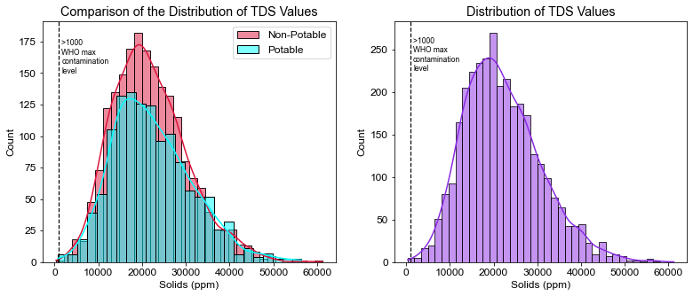
# Percent of water that exceeds WHO's TDS limit
pct_tds = ((df.Solids > 1000).sum() / df.shape[0]) * 100
print(pct_tds)
99.93894993894995
# Compare the water parameter with regards to Potability
chl_0 = df.Chloramines[df.Potability == 0]
chl_1 = df.Chloramines[df.Potability == 1]


# Create figure to compare potable and non-potable values, add annotations and add vertical lines for annotations
plt.figure(figsize=(13,5))
plt.subplot(1,2,1)
sns.histplot(data=chl_0, color="crimson",alpha=0.5, label="Non-Potable", kde=True)
sns.histplot(data=chl_1, color="aqua", alpha=0.5, label="Potable", kde=True)
plt.title("Comparison of the Distribution of Chloramines Values")
plt.xlabel("Chloramines (ppm)")
plt.axvline(x=4, linewidth=1.2, color='black', linestyle='--')
plt.annotate("<4 Safe to drink", xy=(.5, 125), size=11)
plt.legend()


# Create histogram for all parameter values
plt.subplot(1,2,2)
sns.histplot(data=df, x='Chloramines', color="blueviolet", kde=True)
plt.title("Distribution of Chloramines Values")
plt.xlabel("Chloramines (ppm)")
plt.axvline(x=4, linewidth=1.2, color='black', linestyle='--')
plt.annotate("<4 Safe to drink", xy=(.5, 170), size=11)


plt.show()
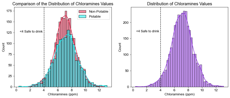
# Water percentage safe to drink in regards to Chloramine values
pct_cl = (df.Chloramines < 4).sum() / df.shape[0] * 100
print(pct_cl)
2.716727716727717
# Compare the water parameter with regards to Potability
sf_0 = df.Sulfate[df.Potability == 0]
sf_1 = df.Sulfate[df.Potability == 1]


# Create figure to compare potable and non-potable values, add annotations and add vertical lines for annotations
plt.figure(figsize=(13,5))
plt.subplot(1,2,1)
sns.histplot(data=sf_0, color="crimson",alpha=0.5, label="Non-Potable")
sns.histplot(data=sf_1, color="aqua", alpha=0.5, label="Potable")
plt.title("Comparison of the Distribution of Sulfate Values")
plt.xlabel("Sulfate (ppm)")
plt.axvline(x=250, linewidth=1.2, color='black', linestyle='--')
plt.annotate("<250 Ideal", xy=(180, 350), size=11)
plt.axvline(x=500, linewidth=1.2, color='black', linestyle='--')
plt.annotate("<500 Good", xy=(425, 350), size=11)
plt.legend()


# Create histogram for all parameter values
plt.subplot(1,2,2)
sns.histplot(data=df, x='Sulfate', color="blueviolet")
plt.title("Distribution of Sulfate Values")
plt.xlabel("Sulfate (ppm)")
plt.axvline(x=250, linewidth=1.2, color='black', linestyle='--')
plt.annotate("<250 Ideal", xy=(180, 525), size=11)
plt.axvline(x=500, linewidth=1.2, color='black', linestyle='--')
plt.annotate("<500 Good", xy=(425, 525), size=11)


plt.show()
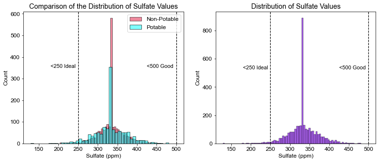
# Calculate percentage of water that has ideal levels of sulfate
pct_sf = ((df.Sulfate < 250).sum() / df.shape[0]) * 100
print(pct_sf)
1.7704517704517704
# Compare the water parameter with regards to Potability
cnd_0 = df.Conductivity[df.Potability == 0]
cnd_1 = df.Conductivity[df.Potability == 1]


# Create figure to compare potable and non-potable values, add annotations and add vertical lines for annotations
plt.figure(figsize=(13,5))
plt.subplot(1,2,1)
sns.histplot(data=cnd_0, color="crimson",alpha=0.5, label="Non-Potable", kde=True)
sns.histplot(data=cnd_1, color="aqua", alpha=0.5, label="Potable", kde=True)
plt.title("Comparison of the Distribution of Conductivity Values")
plt.xlabel("Conductivity (μS/cm)")
plt.axvline(x=400, linewidth=1.2, color='black', linestyle='--')
plt.annotate("<400 Considered\nsafe to drink", xy=(180, 125), size=11)
plt.legend()


# Create histogram for all parameter values
plt.subplot(1,2,2)
sns.histplot(data=df, x='Conductivity', color="blueviolet", kde=True)
plt.title("Distribution of Conductivity Values")
plt.xlabel("Conductivity (μS/cm)")
plt.axvline(x=400, linewidth=1.2, color='black', linestyle='--')
plt.annotate("<400 Considered\nsafe to drink", xy=(180, 175), size=11)


plt.show()
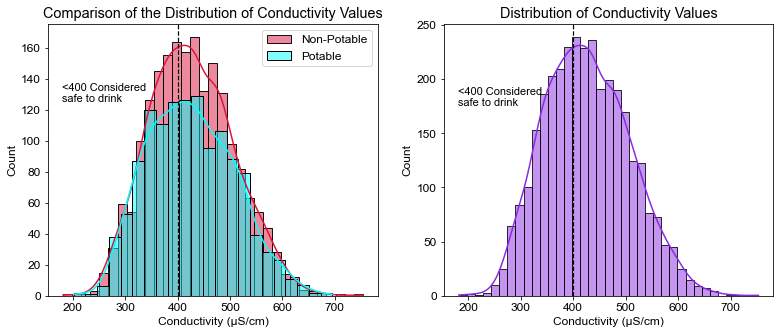
pct_cnd = ((df.Conductivity < 400).sum() / df.shape[0]) * 100
print(pct_cnd)
40.10989010989011
# Compare the water parameter with regards to Potability
org_0 = df.Organic_carbon[df.Potability == 0]
org_1 = df.Organic_carbon[df.Potability == 1]


# Create figure to compare potable and non-potable values, add annotations and add vertical lines for annotations
plt.figure(figsize=(13,5))
plt.subplot(1,2,1)
sns.histplot(data=org_0, color="crimson",alpha=0.5, label="Non-Potable", kde=True)
sns.histplot(data=org_1, color="aqua", alpha=0.5, label="Potable", kde=True)
plt.title("Comparison of the Distribution\nof Organic Carbon Values")
plt.xlabel("Organic Carbon (ppm)")
plt.axvline(x=2, linewidth=1.2, color='black', linestyle='--')
plt.annotate("<2 is the standard\nfor treated water", xy=(3.2, 125), size=11)
plt.legend()


# Create histogram for all parameter values
plt.subplot(1,2,2)
sns.histplot(data=df, x='Organic_carbon', color="blueviolet", kde=True)
plt.title("Distribution of Organic Carbon Values")
plt.xlabel("Organic Carbon (ppm)")
plt.axvline(x=2, linewidth=1.2, color='black', linestyle='--')
plt.annotate("<2 is the standard\nfor treated water", xy=(3.2, 175), size=11)


plt.show()
# What percent of the water tested was under 2 ppm?
pct_org = ((df.Organic_carbon > 2).sum() / df.shape[0]) * 100
print(pct_org)
100.0
# Compare the water parameter with regards to Potability
tri_0 = df.Trihalomethanes[df.Potability == 0]
tri_1 = df.Trihalomethanes[df.Potability == 1]


# Create figure to compare potable and non-potable values, add annotations and add vertical lines for annotations
plt.figure(figsize=(13,5))
plt.subplot(1,2,1)
sns.histplot(data=df, x=tri_0, color="crimson",alpha=0.5, label="Non-Potable", kde=True)
sns.histplot(data=df, x=tri_1, color="aqua", alpha=0.5, label="Potable", kde=True)
plt.title("Comparison of the Distribution of\nTrihalomethanes Values")
plt.xlabel("Trihalomethanes (μg/L)")
plt.axvline(x=80, linewidth=1.2, color='black', linestyle='--')
plt.annotate("<80 is considered\nsafe to drink", xy=(90, 200), size=11)
plt.legend()


# Create histogram for all parameter values
plt.subplot(1,2,2)
sns.histplot(data=df, x='Trihalomethanes', color="blueviolet", kde=True)
plt.title("Distribution of Trihalomethanes Values")
plt.xlabel("Trihalomethanes (μg/L)")
plt.axvline(x=80, linewidth=1.2, color='black', linestyle='--')
plt.annotate("<80 is considered\nsafe to drink", xy=(90, 200), size=11)

plt.show()
# What percent of water was considered safe to drink, under 80 micrograms/L?
((df.Trihalomethanes < 80).sum() / df.shape[0]) * 100
81.62393162393163
# What percent of water considered potable was considered not safe to drink with regards to Trihalomethanes?
tri = df.Trihalomethanes
((tri_1 > 80).sum() / tri.shape[0]) * 100
7.264957264957266
# Compare the water parameter with regards to Potability
tur_0 = df.Turbidity[df.Potability == 0]
tur_1 = df.Turbidity[df.Potability == 1]


# Create figure to compare potable and non-potable values, add annotations and add vertical lines for annotations
plt.figure(figsize=(13,5))
plt.subplot(1,2,1)
sns.histplot(data=df, x=tur_0, color="crimson",alpha=0.5, label="Non-Potable", kde=True)
sns.histplot(data=df, x=tur_1, color="aqua", alpha=0.5, label="Potable", kde=True)
plt.title("Comparison of the Distribution of\nTurbidity Values")
plt.xlabel("Turbidity (NTU)")
plt.axvline(x=5, linewidth=1.2, color='black', linestyle='--')
plt.annotate("<5 is highly\nrecommended", xy=(5.2, 125), size=11)
plt.legend()


# Create histogram for all parameter values
plt.subplot(1,2,2)
sns.histplot(data=df, x='Turbidity', color="blueviolet", kde=True)
plt.title("Distribution of Turbidity Values")
plt.xlabel("Turbidity (NTU)")
plt.axvline(x=5, linewidth=1.2, color='black', linestyle='--')
plt.annotate("<5 is highly\nrecommended", xy=(5.2, 175), size=11)


plt.show()
# What percent of water was under the 5 NTU limit?
pct_tur = ((df.Turbidity < 5).sum() / df.shape[0]) * 100
print(pct_tur)
90.41514041514041
# Create Boxplot for all parameters
plt.figure(figsize=(15,15))

for count, column in enumerate(list(df.columns[0:9])):
    plt.subplot(3, 3, count+1)
    df.boxplot(column)
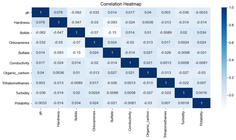
# Correlation Heatmap
plt.figure(figsize=(13,6))
heatmap = sns.heatmap(df.corr(), annot=True, cmap='Blues')
heatmap.set_title('Correlation Heatmap')
Text(0.5, 1.0, 'Correlation Heatmap')
Conclusion
- Less than half of the water was considered potable.
- Half of the measured pH values were considered basic, the other half was acidic. The average pH was neutral.
- 71.5% of the water was considered very hard, the average hardness of water tested was 196 mg/L (Very Hard).
- 99.4% of water tested exceeded the limit of WHO’s recommended TDS value of 1000 ppm.
- Only ~3% of the water was considered safe to drink with regards to chloramine values. EPA’s recommendation is between 1.0 to 4.0 ppm, as health effects are unlikely to occur at those levels. While not recommended, CDC has reported studies showing no health effects from drinking water with chloramine levels higher than 4.0 but less than 50 ppm.
- Sulfate was similar to Chloramine. Only ~2% of the water tested had ideal levels of sulfates. The highest value observed in the dataset was 481 mg/L, which is still under the 500 mg/L limit.
- Conductivity is said to be correlated to total dissolved solids (TDS), but little correlation is seen between the two, according to my correlation heatmap.
- Most of the correlation coefficients were low, except for hardness and pH.
- Less than half had safe conductivity levels (40% of the water tested had levels under 400 μS/cm).
- 100% of the water was outside the recommended limit for TOC’s. The lowest TOC value observed was 2.2 ppm.
- 81.7% of the water was considered safe to drink with regards to Trihalomethanes.
- Only 7.3% of Potable water was found to have unsafe levels of Trihalomethanes. It is important to monitor Trihalomethanes since they are considered carcinogens.
- ~90% of water trials had safe levels of turbidity.